Charts & Maps
A curated selection of my work
The Climate Series
2024
IIn my climate series, I explore three critical environmental themes—water, ice, and fire—each symbolizing the escalating effects of climate change. This collection addresses one of the most pressing issues of our time, showcasing the power of visual storytelling to drive awareness.
I utilized Blender to create hyper-realistic 3D elements, merging these lifelike visuals with graphic and information design. The result is a striking blend of art and data, where the realism of the natural world collides with stark, data-driven narratives.


Rough Charts
2023-2024
In this project, I created a collection of charts using the Rough.js library, bringing an organic, elegant and vintage aesthetic that contrasts with the clean lines of modern day dashboards.
My design Urbanization on the Rise, is currently featured in the European Space Agency’s Little Picture Gallery


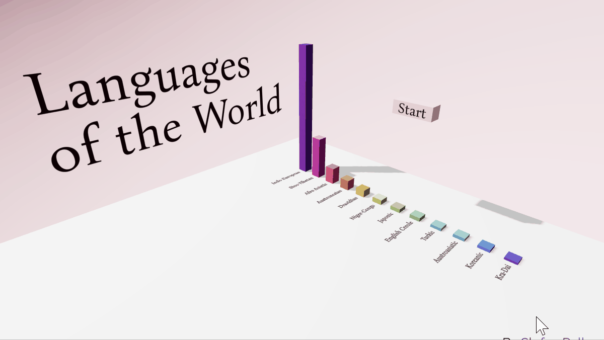
Languages of the World
2023
In this project, I explored the world's major languages through a three-dimensional data visualization. The goal was to create an engaging experience that first surprises the audience with an eye-catching animation and then invites them to interact with the data, allowing for personal exploration and discovery.

The Geography of Livestock
2025
I set out to design a thematic world map that works beautifully on mobile. Inspired by 16th-century projections, it presents the global distribution of livestock in a user-friendly way.

Overstressed Inequality
2025
An experimental chart built in Blender that highlights the stark gender inequality in stress-related conditions.
Wine Maps of Portugal
2025
A personal project: redesigning two maps of Portugal’s wine regions with Copernicus Land Monitoring Service satellite data.

